


THE BRIEF
Refine the brand identity for Woof & Whisker: a conceptual e-commerce pet supply brand.
THE ORIGINAL CONCEPT
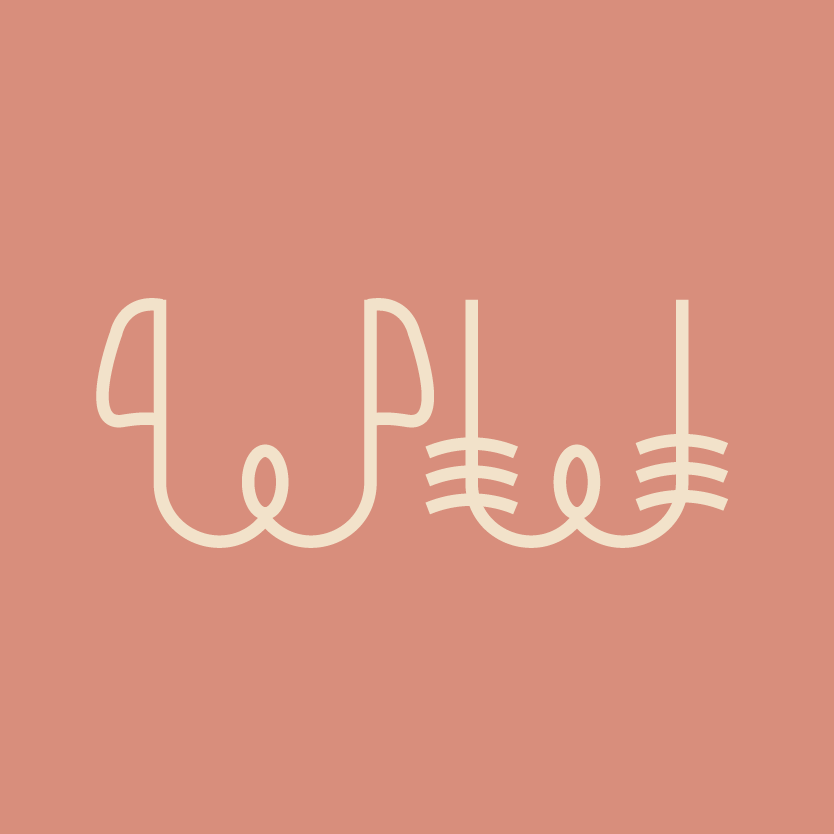
While the original concept is good, this logomark is unrefined. The dog has no lines that end in a horizontal line, while the cat W has only that. For a brand envisioned to embody playfulness, horizontal stroke caps are a bit too harsh. The whiskers on the cat are not lined up, and they’re too long. The colors have no relation to the intended brand identity. There’s also no wordmark.
THE REFINED CONCEPT

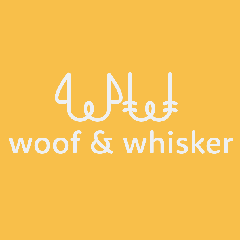
To balance playfulness with sophistication, golden yellow is paired with a light grey/blue. The shade of yellow in particular is very important: a brighter yellow would have been too childish and a darker mustard yellow too dingy. By mixing in an orange undertone, the energy becomes more grounded yet still vibrant.
For the logomark, the shape of the dog ears is now more streamlined. The bottoms of the ears are aligned with the top of the “nose” rather than arbitrarily placed. It’s the same with the whiskers; the lines start at the top of the “nose.” There are also two whiskers on each side now, and they are much shorter and in alignment with one another.
Because the stroke caps are now rounded, a complementary typeface for the wordmark with rounded terminals works well here. Rooney Sans Medium ended up being the perfect fit. Designed by Jan Fromm, it adheres to traditional sans-serif proportions, giving it a classic and inviting appearance.
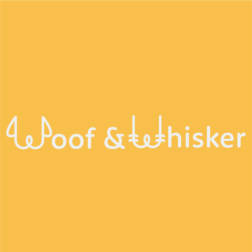
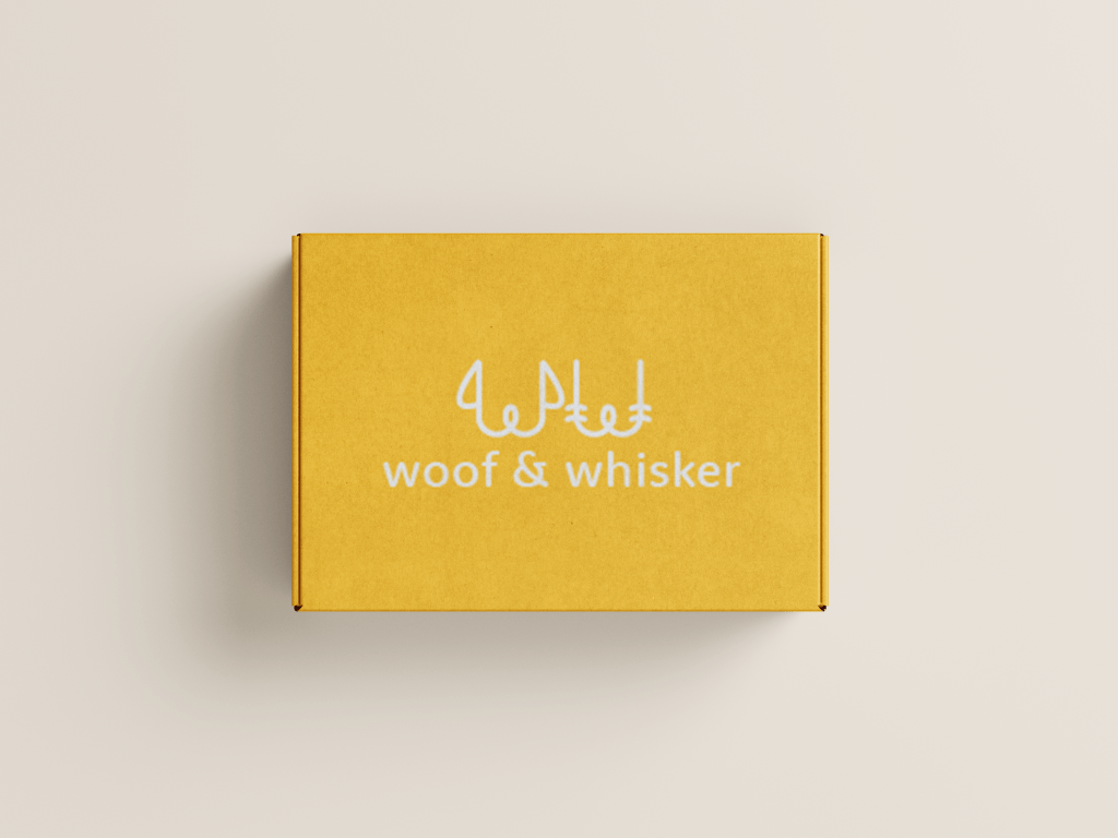
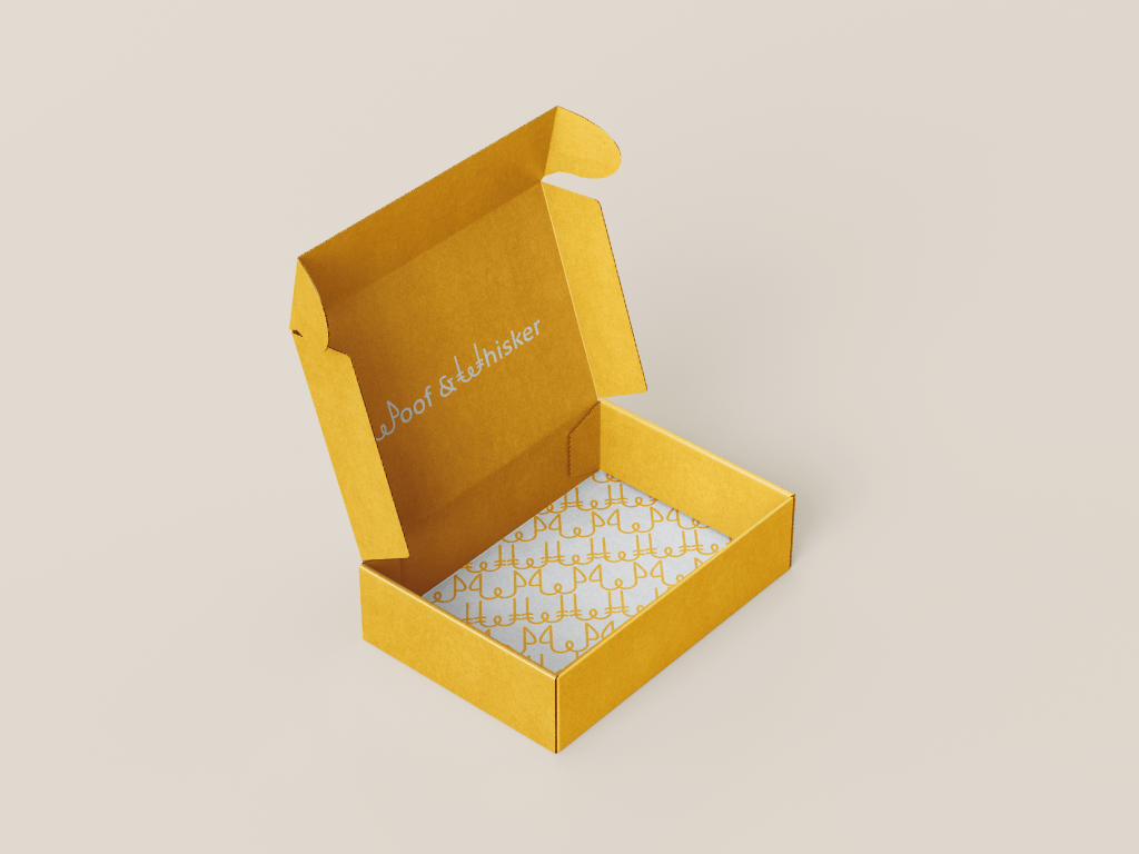
The Woof & Whisker refreshed branding has both horizontal and vertical orientations. It also includes a repeat pattern of the logomark in both colorways, applicable as a packaging design element.
