
The BRief
Cut Two is a conceptual cottage business that would make beautiful, useful items from up-cycled textiles. This project posed the question: what does it mean to create a sustainable brand in the fashion and home goods space? In an industry with so much greenwashing about sustainable practices, it was important to ensure Cut Two was perceived as honest, reliable, and independent. The branding needed to stand out from the crowd while standing up for those values.
the brand Name
Sewing pattern instructions always specify how many of each piece to cut from the fabric, often explicitly indicating the sewist should “Cut Two.” The name is also reminiscent of the phrase “Take Two” that is used to indicate a second filming of a movie scene. Since all of Cut Two’s products would be hand-sewn using up-cycled textiles, this brand name perfectly connects the method of product creation to the second chance for these textiles to be used rather than sent to landfills.
the Logo
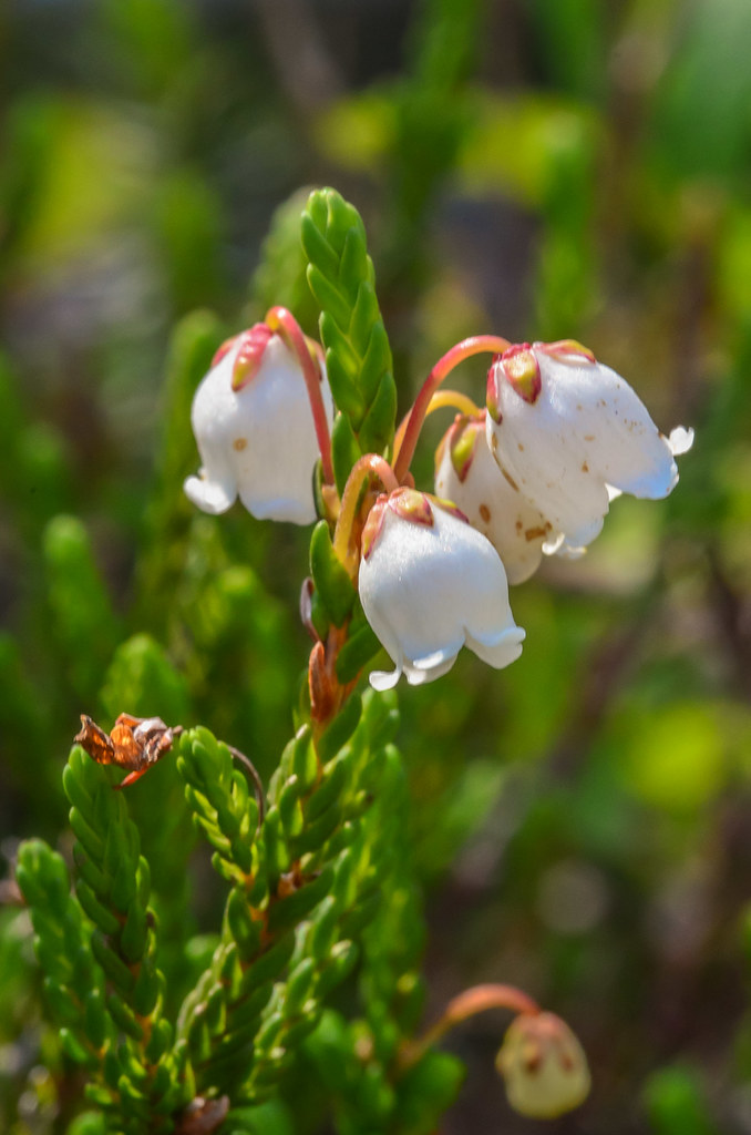
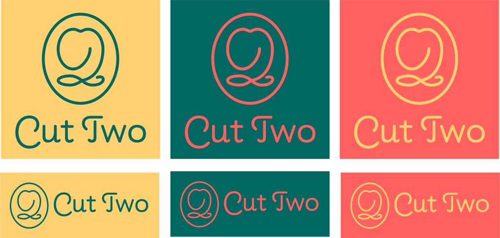
The Cut Two logomark combines the letter C and the number 2 (as an abbreviation of the brand name) with the bell-like shape of White Mountain Heather. This small alpine flower grows at high altitudes and is adept at surviving harsh weather. It represents independence, resourcefulness, beauty, practicality, and perfectly complements what Cut Two stands for.
The brand colors are bright and vibrant, contrasting with other sustainable brands that opt for gentler colors as an indication of sensitivity toward nature. Cut Two’s branding instead includes a deep forest green with a turquoise undertone not often seen in this space. A sunny yellow offers a balancing warmth and a bright coral adds energy and excitement.
The wordmark is set in the typeface Pauline: a fun yet refined sans serif influenced by retro scripts.
