
THE brief
Create a dynamic logo for Spaceflight Everyday, an aerospace media brand, using symbols that resonate with and attract the attention of people interested in space, science, and technology.
the Logo
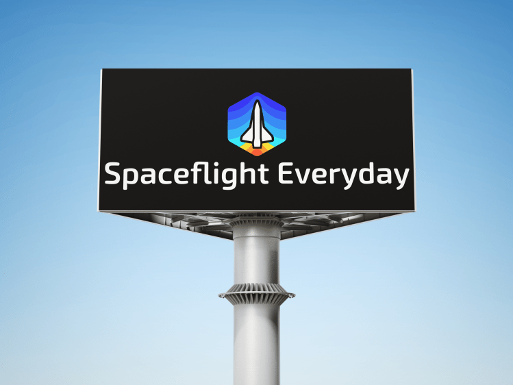

The elements of the Spaceflight Everyday logo draw inspiration from symbols that are well-known to the aerospace community: the Space Shuttle and hexagons (the shape used in the panels of the James Webb Space Telescope). Behind the Shuttle, a stepped gradient following the Shuttle shape represents liftoff and ascension through Earth’s atmosphere.
The Impact
In the two weeks following the new logo being displayed on Spaceflight Everyday’s social profiles:
- Follower count went up 47.9%
- Account reach went up 277%
- Engagement went up 206%
In that time, all other variables– including the type of content being posted– remained the same.
About six months later, Spaceflight Everyday surpassed 150k followers. That’s up from 50k followers at the time of rebranding.
Sometimes, all it takes is some intentional design to refine your brand image in a way that resonates with your intended audience. A strong visual identity paired with consistent marketing remains a sure-fire way to grow brand reach – even in spaces that appear to be saturated.
